I recently went for a trip on the Watercress Line. I blogged about the ride but decided to write a separate post about design because I found so many nice things! This is a small collection of locomotive typography, patterns and design elements.
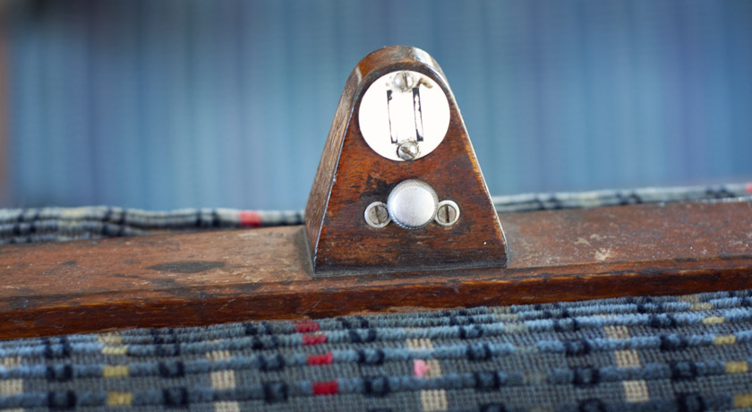
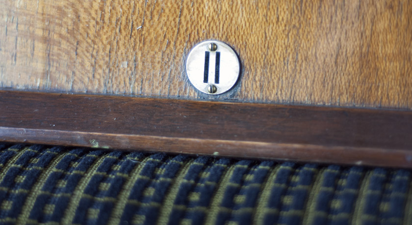
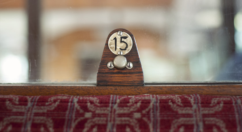
I had a soft spot for these seat numbers. Small numbered disks mounted onto wood on the top of each chair. Each class of travel had a different font. Lovely!
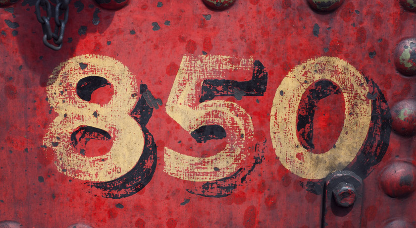
This yellow lettering was painted on the side of an SR Lord Nelson Class train in the engine yard. Love the texture and the number 8.

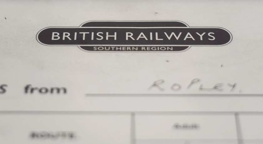
An old British Railways logo. After doing some research I discovered this logo was used from 1956-1967 and is referred to a the ‘Sausage totem’. The font used is Gill Sans. I found a great article about Gill Sans and the British railways on the beauty of transport blog.
These are numbers painted on the side of a 925 – Cheltenham – a locomotive built in 1934. 80 years on, it’s still chugging around the Hampshire countryside.

Another seat number. These were in the first class carriage but they look less grand than those in standard class.
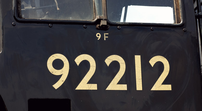
We saw this train in the engine yard. The 99212 is a British Railways Standard Class 9F steam train built in 1959. I like the gold lettering on black and the cracked texture.
Another seat number. Can you tell I have a soft spot for these? This one looks like it rubbed off and someone coloured it back in.
This is seat fabric. If it was still in production I’d cover my sofa in it! Fantastic colours and pattern.
*Update: Thanks to Daniel Wright for contacting me to let me know this seat fabric is called Trojan and was designed by British Rail in the 1960’s.

This window latch has a great arrow graphic. Similar to Johnston Underground Extras but not an exact match. Does anyone know what font has been used (for both lettering and arrow)?
![]()
Another ‘Sausage totem’ for first class passengers.

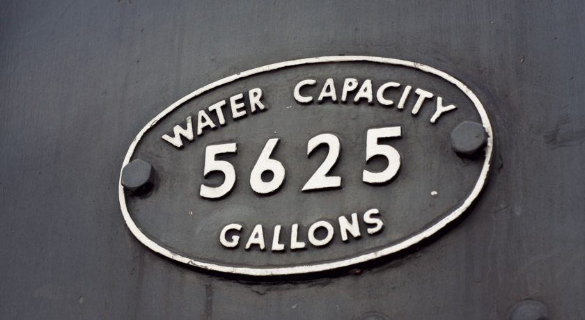
This water capacity information was raised out of metal and the paint had worn off the edges, making the letters look stamped. I can’t get my head around this much water fitting inside a train.
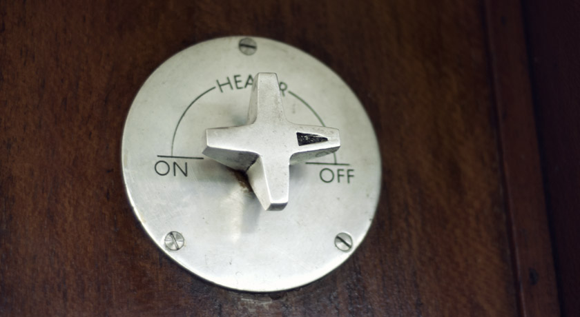
Lastly, a heating knob. I really like the design (reminds me of Dieter Rams a little) and typography. So simple and well made.
And that’s the design I found on the Watercress Line. I wish modern trains had this much character. Scott made a good point; that I probably wouldn’t have appreciated it at that point in time because it would have been every day life. The thought of people cooing over the trains we ride on now, in a few decades time, makes me laugh. Bilevel rail cars being the exception – what is there not to like about a double decker train!?
*rubs thighs*